While minimalist design may not be exactly new, it is certainly having a new moment right now. The more hectic our modern lives become, it seems, the more we long for a simple, calming home to return to.
As you may well know, a minimalist look is one that is, well, minimal in terms of the “stuff” going on in a visual space. Not only is this pleasing and less distracting to the eye, but your minimalist home design will likely make any future moves a lot simpler! Fewer belongings means less to move, and smaller spaces will feel more comfortable. But just to be clear, contrary to some minimalist nay-sayers out there, a modern minimalist home design doesn’t mean one that’s lacking in creativity and warmth.
Read on for some essential elements of minimalist interior design — and some tips and tricks to get you started on your own home makeover.
Function

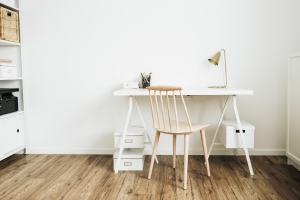
Minimalist design is all about stripping down to the essentials. This doesn’t mean a dining room with one chair and table and nothing else, but rather that the items you choose to put in your space should all serve a function.
Decor, of course, is still fair game, but you should restrict non-essential items to one or two focal points. When in doubt, cut down on the knick-knacks. Thinking about functionality when deciding what items to bring into a room reduces clutter and allows you to truly appreciate the beauty and usefulness of each of them. For example, decorating with one vase on a tabletop, a standing lamp, and an ottoman footstool leaves a room just as cosy and functional without the added clutter.
Balance
Balance applies in a couple of different ways with minimalist home design.
First is the more literal balance of items distributed in space. Note that this doesn’t necessarily mean symmetrical! Balance takes into account size as well as weight and colour.
Second is the overall balance of form and function. Minimalism emphasises function, but not at the total expense of aesthetics. Simple doesn’t have to mean boring!
Abiding by minimalism doesn’t mean you can’t get creative.
Creativity
Abiding by minimalism doesn’t mean you can’t get creative. It might seem counterintuitive, but some style constraints can actually inspire you to think more outside the box! It allows you to be more intentional with each choice.
An old trunk can be a decor centrepiece that also functions as combo coffee table, footstool, and storage bin. Configure a fold-up wall desk so your workspace can double as decor rather than a dominating feature of the room when not in use. Less clutter in your home frees up your mind for even more creative thinking elsewhere in your life!
Negative Space
Blank space is your friend when it comes to minimalism — less truly can be more. A simple, striking choice, like one very beautiful piece of art on a large clean wall, can often be more impactful than packing the space with lots of clashing prints.
Scale
Play around with it! Just don’t forget to balance. The giant painting and the oversized sofa should probably go on opposite walls.

Colour
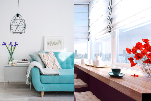
Hearing the term “minimalist design” might conjure up nightmares of asylum-white walls, but colour is not only allowed, it’s encouraged! While simple, monochromatic colour palettes are definitely a staple of minimalist interior design, this doesn’t mean everything has to be the same hue.
Including multiple shades of the same colour in one room is a great way to make a space still feel dynamic, without overwhelming the eye. And accent colours are also very important when it comes to balance and focal points.
Taking up minimalist design doesn’t mean you have to burn everything you own that’s hot pink, it just means you can pare down to a few favourite pink items which will really be able to shine in your otherwise simpler space!
Texture
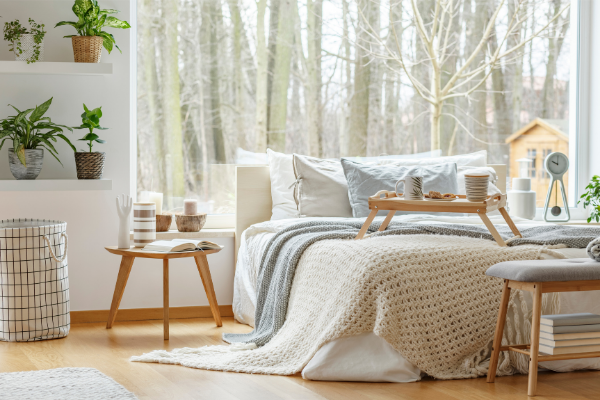
While you may be holding back a little on knick-knacks and colour, texture is the place to go a little wild when you’re taking on a minimalist design. Different textures add some of that dynamism we were talking about before, but they also help balance out a space. Think tiled flooring topped with a shag rug or a leather sofa draped with a crochet blanket. Think about soft and rough, light and heavy, yin and yang.
Colour is not only allowed, it’s encouraged!
Form (Geometric Shapes)
Clean, simple lines and geometric shapes are the way to go when it comes to minimalist design. Choose a simple, cylindrical sconce for lighting rather than an ornate Victorian-era piece. Think of what feels comforting to look at, rather than what’s showy and distracting.
Simplicity
Minimalism is the opposite of gaudy. It is simple, light, and beautiful. Gilded picture-frame mirrors are cute, but not when they’re stealing the show from the gorgeous view outside your window. Go with something that shows off the reflection rather than the frame.
Light

Light is definitely one thing you don’t want to be minimal about when it comes to this style! Let in all the natural light you can and keep the colour and form simple when picking out lamps and light fixtures. Just remember, light means bright and airy, not blinding!
Nature
Thinking about colours and textures that naturally occur together out in the great wide outdoors is a great way to get your minimalist juices flowing. Nature, after all, has a great sense of harmony and balance on its own.
All of these tips might sound overwhelming, but the thing to remember about minimalism is that less can be more! Start by finding one or two most essential, functional items for your space, and build out from there. You’ll be feeling more calm (and chic) in no time!

